The choice of a decorative material is no longer limited to its hue or visual appeal. The chemical composition of coatings, the origin of textiles, and the behavior of finishes over time have become essential selection criteria. We are observing a clear shift: interior decoration now incorporates technical and health constraints that alter the hierarchy of priorities during a design project.
VOC Emissions and Labeling: The Health Criterion That Decoration Still Ignores
In France, construction and decoration products intended for indoor use must carry a volatile pollutant emissions label ranging from A+ to C since September 1, 2013. This classification applies to paints, varnishes, adhesives, floor coverings, and wall coverings.
We recommend systematically checking this label before any purchase. A wall repainted with a paint rated C in a poorly ventilated room measurably degrades air quality. Deep matte finishes, which are very present in current trends, sometimes use binders with high levels of volatile organic compounds to achieve this velvety appearance.
Alternatives do exist. Mineral paints based on silicate or lime generally display an A+ rating. Their matte, slightly irregular finish fits into the trend for textured surfaces that marks decoration in 2026. To deepen your choices in home and decoration on Votre Déco, product sheets often specify this type of classification.

Upholstery Textiles: Linen, Twill Cotton, and Boiled Wool as Technical Alternatives
Regulations on upholstery textiles prompt a reconsideration of the materials used for curtains, cushions, sofa fabrics, and textile coverings. The chemical fire-retardant treatments applied to synthetic fabrics raise questions about durability and indoor air quality.
Naturally resistant materials are becoming relevant alternatives to chemically treated textiles. Thick linen, twill cotton, and boiled wool provide satisfactory fire resistance without additional treatment, while offering a rich texture that meets current expectations.
- Thick linen (with a sufficiently dense weight) resists flames well and develops a patina over time, enhancing the effect of living material sought in contemporary interiors.
- Twill cotton, woven diagonally, has superior mechanical strength compared to standard cotton and accepts plant dyes without loss of durability.
- Boiled wool, naturally fire-resistant, absorbs ambient moisture and regulates surface temperature, making it a technical as well as aesthetic choice for seating.
Prioritizing these fibers addresses both decorative and health issues simultaneously, without compromising on appearance.
Personalization of Interiors: What the Numbers Reveal About Demand
A study by Airbnb-IFOP cited by Le Journal de la Maison indicates that 60% of French respondents consider their daily environment increasingly uniform. At the same time, 71% desire more color in their living space.
These data document a rejection of standardized interiors. The mix of eras, thrifted pieces, and artisanal creations responds to this demand better than a homogeneous catalog. We observe that the most successful projects rarely combine more than two or three families of materials, but instead feature unique pieces that break the monotony.
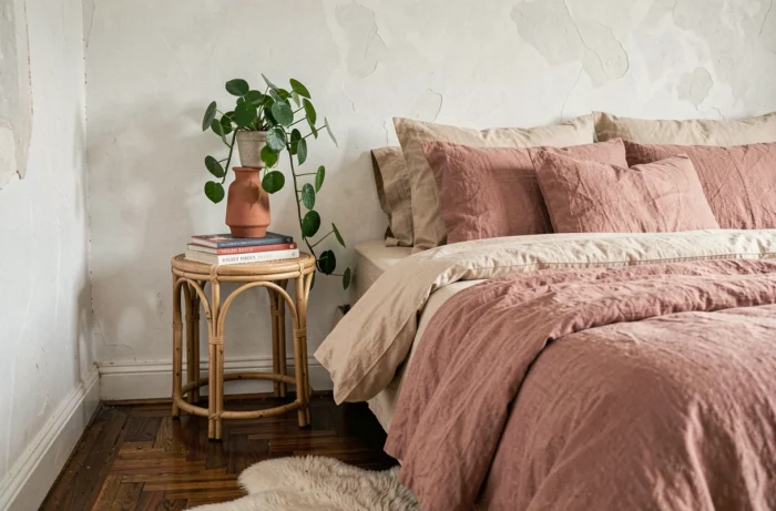
Cracked ceramics, irregular blown glass, or hammered metal, highlighted at the Maison&Objet fair, illustrate this quest for uniqueness. An object that bears the trace of its making creates a more effective focal point than a smooth, reproducible accessory.
Compose with a Few Strong Elements Rather Than Accumulate
Placing one or two strong personality objects per surface (shelf, console, mantelpiece) with real gaps between them creates a clear visual balance. Decorative accumulation dilutes the impact of each piece and paradoxically recreates the uniformity that the project sought to escape.
Matte Finishes and Muted Colors: Balancing Aesthetics and Maintenance
Deep matte finishes dominate the palettes offered by paint manufacturers for the season. Matte absorbs light, reduces glare, and gives walls a depth that satin cannot replicate. In return, a matte finish shows marks more easily from friction and complicates cleaning in high-traffic areas.
For high-use areas (hallways, kitchens, children’s rooms), a compromise is to apply deep matte on one wall and treat the other surfaces with discreet satin. The contrast in sheen between the walls creates a subtle play of light that structures the room without resorting to contrasting colors.
- Deep matte walls: reserve for areas less exposed to contact (headboard, back wall of the living room).
- Baseboards and frames: prefer a washable satin, ideally rated A+ for emissions.
- Ceilings: matte remains the technical standard, as it masks surface defects and reduces unwanted reflections from light fixtures.
Combine Muted Colors with Natural Light
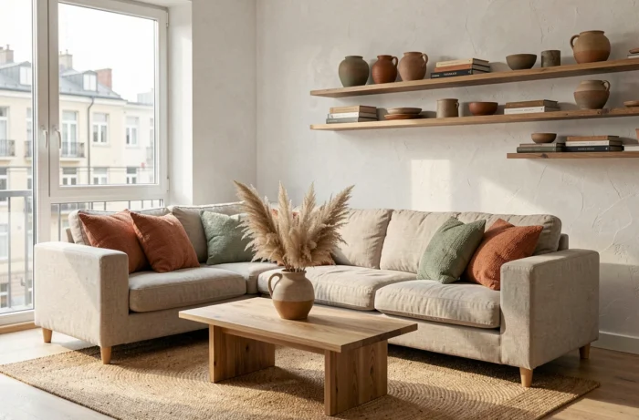
Terracotta, sage green, or muted blue tones absorb a significant amount of ambient light. In a north-facing room with few openings, these colors can darken the space to the point of making it uncomfortable. We recommend testing a sample directly on the relevant wall and observing it at different times before finalizing the choice.
The ratio of glazed surface to painted wall surface conditions the final result much more than the color itself. A sage green in a traversing living room produces a radically different effect than the same green in a single-oriented bedroom. Testing the color in situ remains the only reliable method to avoid disappointments.
Decoration is becoming technically demanding without losing creativity. Choices of materials, finishes, and textiles now respond to intersecting criteria: aesthetics, health, maintenance, and durability. Addressing these parameters together from the design phase avoids costly corrections once the project is delivered.